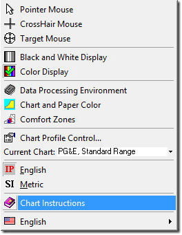
The following is a comprehensive step-by-step walk-through of the HDPsyChart software. For more information on features and ordering, click here.
Thank you to David Sellers of Facility Dynamics for creating this comprehensive training.
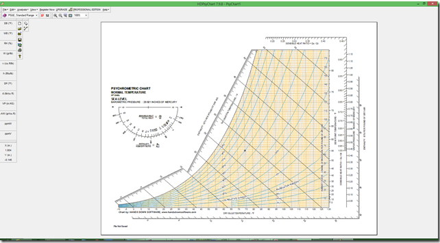
Even though it is a limited version, it is still a very useful tool since it allows you to plot points, read the parameters associated with the location of your cursor, create a .pdf of your chart, and copy the image to your clipboard for use in a report or presentation.
Contents
For this post, I thought I would focus on what the basic version of the chart can do by using an example. The links below will jump you to topics of interest, since this is another long post. The Return to Contents like at the end of each section will bring you back here.
- Plotting a Point
- Adding a Second Point
- Plotting a Process
- The Impact of Sensible Heat Ratio on Cooling Coil Leaving Conditions
- Plotting the SHR Line
- Apparatus Dew Point
- Plotting a Mixed Air Condition
- Professional Version Extras
Plotting a Point
As a starting point, let’s plot the “generic” ASHRAE standard space condition of 75°F and 50% relative humidity and then read all of the other psychrometric parameters off of the chart. To start, you need to open the Psychrometric Process window, which is accessible from the Analysis drop down menu.
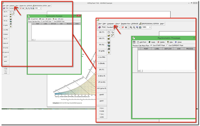
Once you have the window open you can adjust the size and column width if you want to by dragging and clicking the boarders of the window or the column dividers.
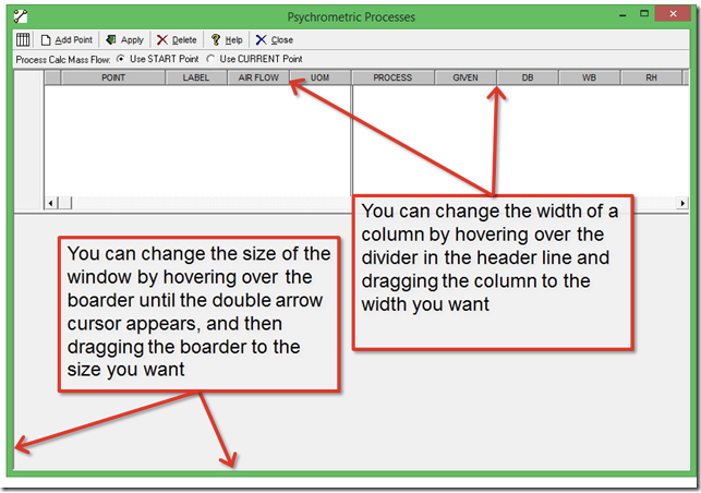
Even in the basic version of the chart, there are a number items you can manage in the psychrometric process window, including naming a point, controlling where the label sits relative to the point, the air flow you are dealing with for your process and its units of measure, and the type of process.
To place a point on the chart, you click on the Add a Point button in the Psychrometric Process window, which will add a row to the table and open a sub-window in the lower portion of the main window, which is where you will eventually enter you data.
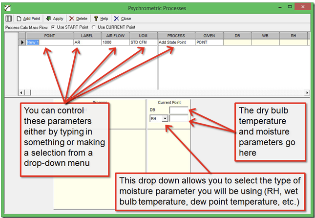
To enter a point, you need to know the dry bulb temperature and some other metric that is an indication of moisture, like dew point temperature, specific humidity, wet bulb temperature, or relative humidity. We are using 75°F as our dry bulb temperature and 50% RH as our indication of moisture. So at a minimum, to get a point on the chart, you will need to type in:
- The name of the point in the Point column, and
- The dry bulb temperature next to DB in the sub-window under Current Point, and
- The relative humidity (or other indication of moisture content) in the sub-window below the dry bulb temperature. You will also need to pick the units of measure for this point (RH, Wet Bulb, etc.) using the drop down menu to the left of the box where you enter moisture content number.
Then, click on the Apply button at the top of the Psychrometric Process window. When you are done, things should look something like this.
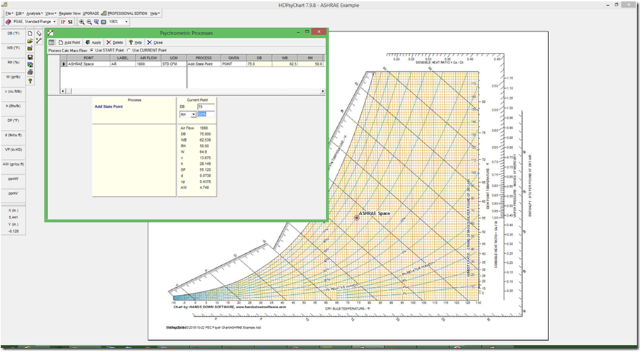
Notice how there now is a red dot labeled ASHRAE Space on the chart and that as soon as you entered the moisture data, all of the other psychrometric properties associated with the point appear in the sub-window below the boxes where you entered your data.
You can move the location of the label relative to the point by changing the settings in the Label column using the drop down menu that is provided there. For instance, here is what things look like if I select B for Below instead of AR for Above, Right in the Label column.
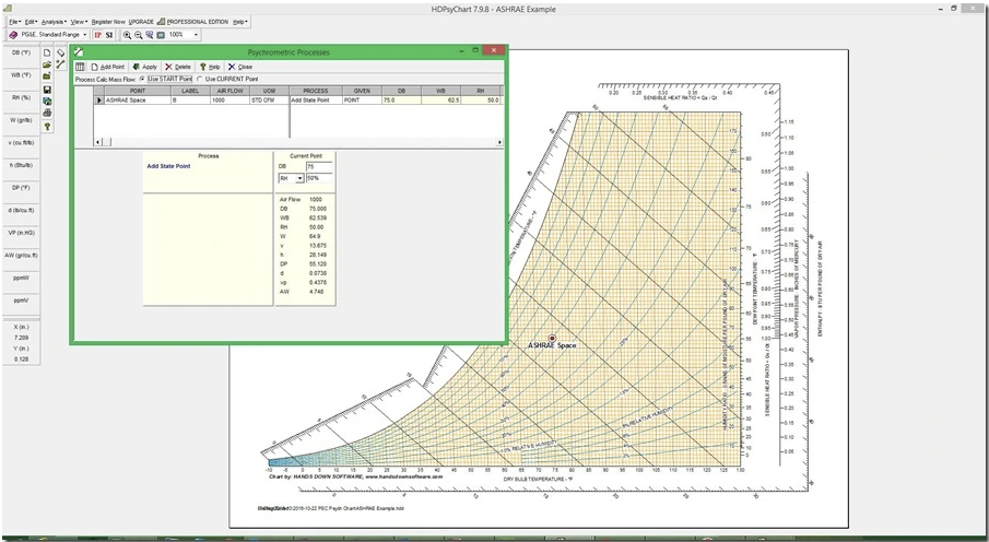
You could also change the airflow and its units of measure in the appropriate columns, but I generally accept the defaults.
Adding a Second Point
Now, suppose we took the air from our ASHRAE Space and passed it over a cooling coil so that it left the cooling process at 55°F dry bulb (often abbreviated as 55°Ftdb) and 54.6°F wet bulb (often abbreviated as 54.6°Ftwb). and we wanted to show that process on our chart. Our system would look like this
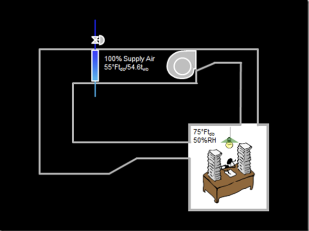
We would start by clicking the Add A Point button on the Psychrometric Process window and typing in our data, just like we did to put the ASHRAE Space into the table. This will add another row to the table and, when we click Apply, will plot the point on the chart.
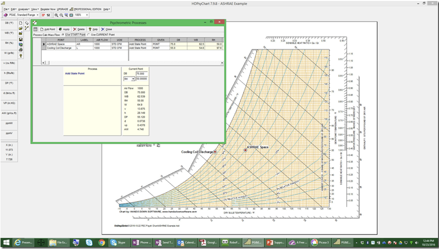
Here is a screen-shot of just the table so you can see it better.
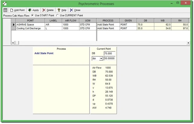
And here is the chart vs. a screen shot of the chart instead of the entire working window so you can see it better.
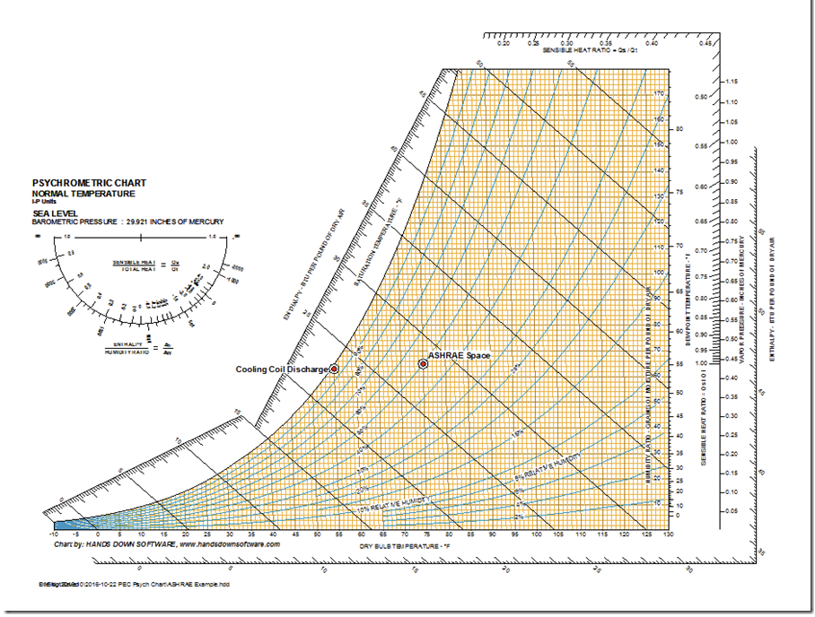
To get the image above into the blog, I used another handy feature of the electronic psych cart. By selecting Copy Chart Image to Clipboard from the Edit dropdown menu, I captured the image to my clipboard. I can then paste it into other applications like Word or PowerPoint or Excel for making a report or for illustrative purposes in this blog post.
If you are wondering how a designer arrives at the coil leaving conditions, that is a topic for a future post. But we discuss it in the VAV Systems, Design, Performance and Commissioning Issues class at the Energy Center and this link will take you to those slides, which should give you a sense of how it is done and why different load conditions require different coil leaving a conditions.
Now lets do something different. You may have noticed that there is a column labeled Process in the Psychrometric Processes window. If you click into that cell, you will discover that there are a number of options aside from Add State Point. Specifically, you can also pick Connect State Point and Cooling Coil.
Since the point we just entered was the cooling coil discharge temperature for a system handling return air from our ASHRAE space, let’s select the Cooling Coil option. When we do that, the Psychrometric Processes window changes a bit, as you can see below.
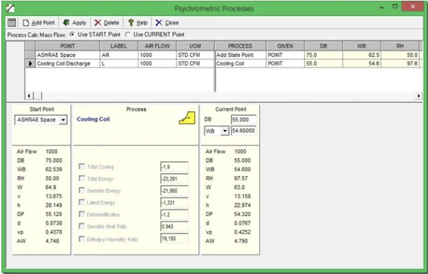
Notice how you can now pick a start point for the process. If we had more than one point on our chart, we could pick any of them using the drop down menu. For our cooling process, the start point was the ASHRAE Space, so we will simply accept that and click Apply. When we do that, the psych chart adds a line from the ASHRAE Space to the Cooling Coil Discharge that approximates the path the air would take as it passes through the cooling coil.
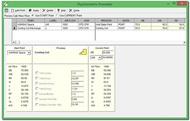
The reason that the line is straight and then curves downward as it approaches the saturation line is that for most coils, most of the heat transfer initially is sensible heat transfer (heat transfer you and I detect as a change in temperature). But as the air cools towards saturation, some of the heat transfer is in the form of latent energy (the energy that is keeping the water in the air in a vapor state; you and I detect it as a change in humidity).
Plotting a Process
To plot the entire process for our little system, we need to connect the Cooling Coil Discharge point with the ASHRAE Space point since the air in our simple little system simply flows from the space to the cooling coil and back to the space again. If we change the process for the ASHRAE Space point from Add State Point to Connect State Point, we get this.
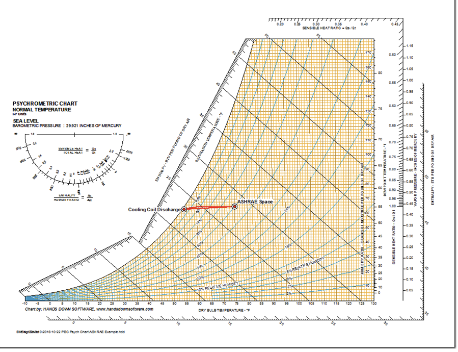
Notice how there is now a straight line between the Cooling Coil Discharge point and the ASHRAE Space point. This line is a bit more theoretical than the cooling coil line and is a Sensible Heat Ratio (SHR) line. Sensible Heat Ratio is pretty much what the name implies; its the ratio of the sensible load in the space to the total load.
Designers come up with it by doing a load calculation that considers how much latent energy, how much sensible energy and how much total energy will be added to a space by the loads it contains. The bottom line is that to maintain steady state conditions in the space, the air leaving the cooling coil has to be cool enough so that when the sensible energy in the space is added to it, you end up at the space temperature. And it has to be dry enough that when the latent energy added to it, you end up at the humidity level you have targeted.
Generally speaking, that means that with all other things being equal, loads that have a a big latent component will require colder air than loads with a small latent component. That is because we typically dry the air out by cooling it below its dew point. All of that is fodder for a future blog post and is explored a bit in the slide deck I referenced previously.
What is cool about the SHR line (I say “cool” in a nerdy sort of way) is that when you plot it on the chart, it represents how much the process has to cool the air and dry the air so that when the air is delivered to the space, it will meet the load requirements in terms of sensible and latent energy.
The Impact of Sensible Heat Ratio on Cooling Coil Leaving Conditions
I set up the chart for our little exercise using a SHR of 0.95, which is a bit high for commercial buildings. I did it so the coil discharge temperature was 55°F, which seems to be the temperature everyone thinks their systems should run at. If you are following the discussion, I suspect you can see that is not necessarily true and that the actual temperature is very dependent on the amount of humidity you have to handle in the space and the dry bulb and dew point/specific humidity that you need to end up at.
If you consult Arthur Bell’s book HVAC Equations and Rules of Thumb, you will discover that for commercial buildings, SHRs can run from 0.75 – 0.93. In contrast, places like Theaters can have SHRs in the range of 0.65 – 0.75 because the number of people in them adds considerably to the latent load and thus, lowers the SHR. But places like the clean rooms I was involved with during my tenure at Komatsu Silicon American can have SRHs that approach 1.o.
If we were to plot our little process out for a space with a SHR of 0.85 instead of 0.90, we would end up needing a Cooling Coil Discharge Temperature in the range of 53.0°Ftdb/52.8°Ftwb. If you needed to meet the 68°Ftdb,/45%RH conditions we needed in our Epitaxial cleanroom at KSA, you had to come off the coil at 46°Ftdb,45.8°Ftwb.
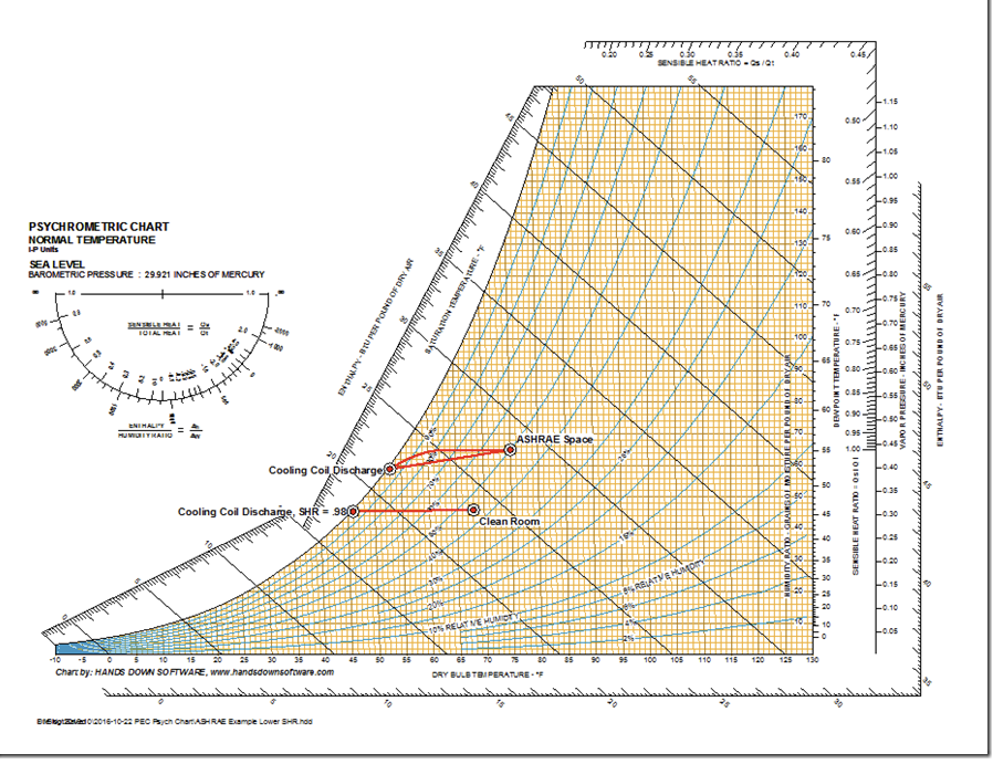
So, you probably are thinking that the SHR line is a pretty important and useful line to be able to plot on your chart and may be wondering how to do that. You do it by using the SHR scale, which is the little protractor shaped thing in the upper left corner of the chart.
Plotting the SHR Line
Plotting the SHR Line in the Pro Version
If you upgrade to the full featured version of the chart, you can do this very quickly as a part of the tool by simply drawing a SHR line through the space condition using the Constant Line Control tool, which is one of the many tools you get if you upgrade the basic chart. If we did that for an ASHRAE space with a SHR of .8, it looks like this.
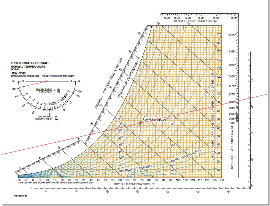
Notice that there is now a line through .8 on the SHR protractor and a parallel line through the ASHRAE space point. Note that the line also goes through 0.80 on the SHR scale that is on the right axis of the chart.
Plotting the SHR Line on a Paper Chart and in the Basic Version
At this point, you may be thinking bummer, I sure wish I could plot the SHR line on my basic chart without having to upgrade since my budget is tight right now. The good news is that you can if you put a copy of the chart into PowerPoint or Word. Here is how you go about doing that.
Let’s start with a copy of the basic chart. and point out a few things.
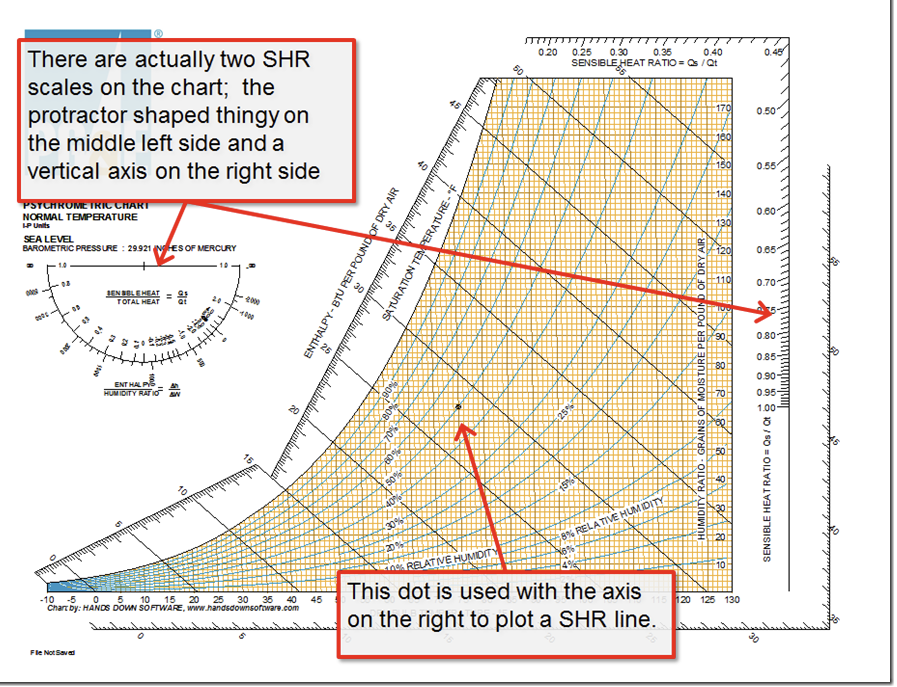
There are actually two ways to plot the SHR line, the protractor and the vertical scale and the dot. Notice that the dot just happens to be at 75°Ftdb,/50% RH. So, if that happens to be the condition of interest, then the vertical axis and dot approach is very convenient.
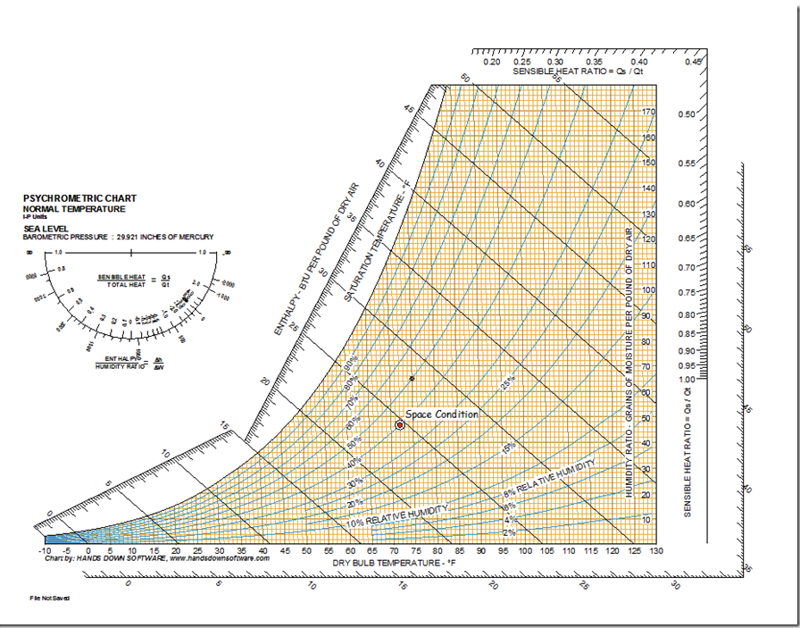
But if you are looking at other conditions, then you will have to use the protractor or vertical scale and dot to set the slope of the SHR line and then transfer it to the point of interest. To illustrate this, lets use a space condition of 72°F tdb/40% RH and plot the line for a SHR of .8 through that point. To get started, you would first plot the point of interest in the electronic chart, just like we did in the example above. Here is what that should like like when you get finished.
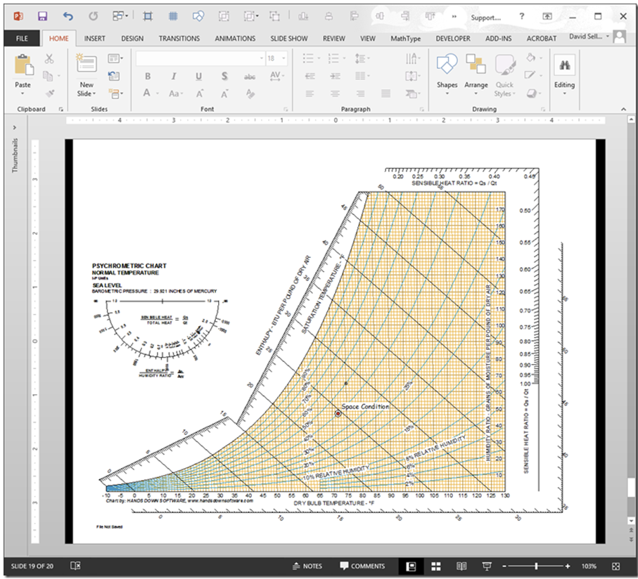
Next, copy the image to the clipboard and then paste it into PowerPoint or Word or Excel. I tend to use PowerPoint because for me, it is the easiest to draw in. Here is what that should like like when you are done.
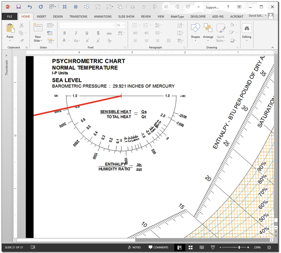
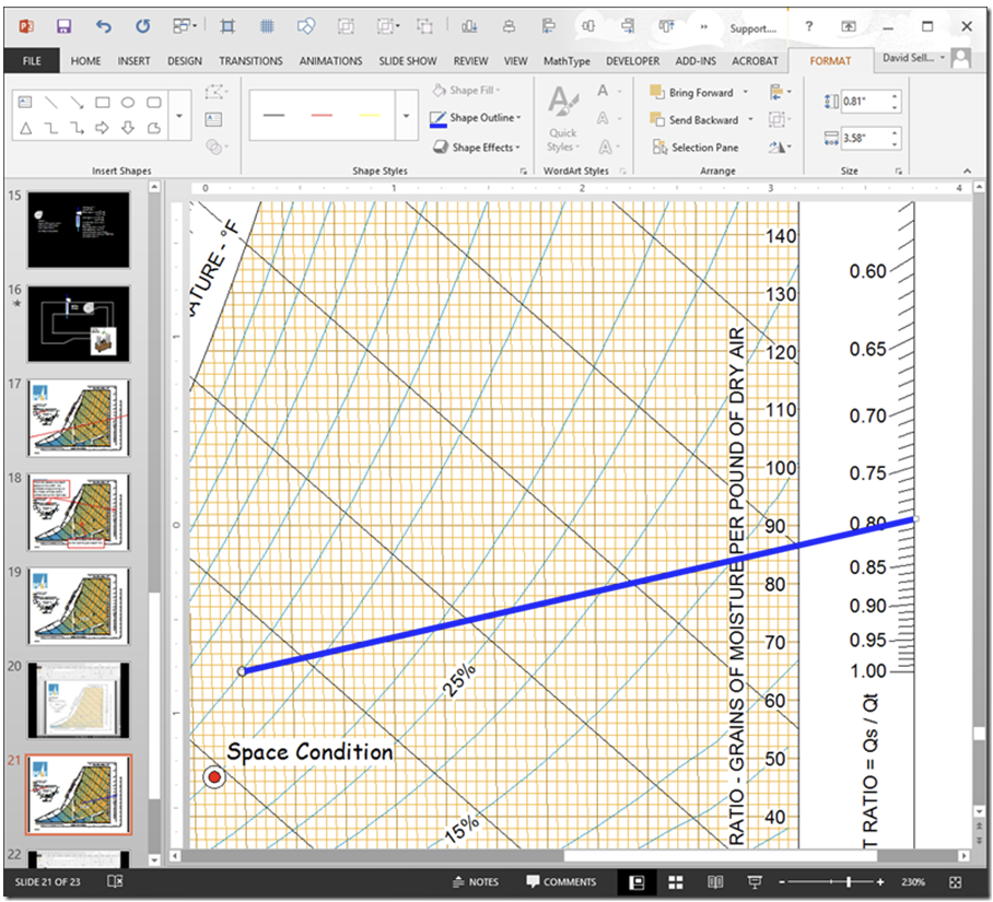
Next, you plot the SHR line using either the protractor or the vertical axis and dot. If you use the protractor, one end of the line goes through the little vertical hash mark on the top horizontal scale and the other end goes through the SHR of interest; in our case 0.80. Here is what that would look like if you did it that away (Note that I have zoomed in on the PowerPoint slide to let you see it better).
Alternatively, you could plot the SHR line by placing one end of it at the dot at 75°Ftdb,/50% RH and the other end through the SHR of interest on the SHR scale on the right side of the chart. If you did it that way, it would look like this.
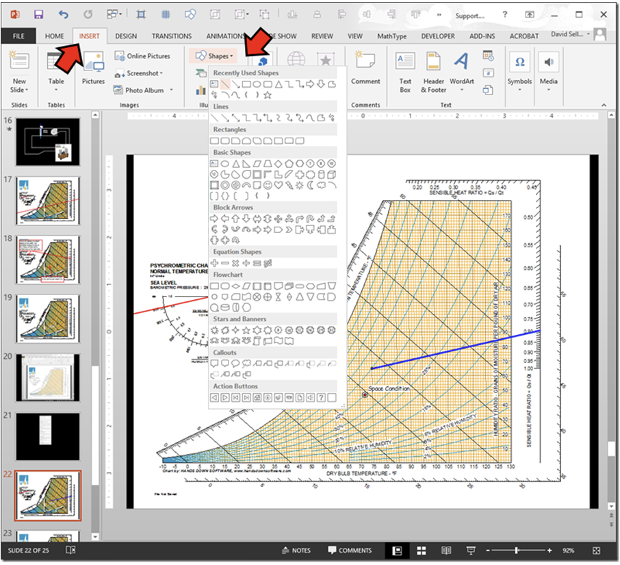
Incidentally, if you are wondering how you draw the actual line, you use the Shapes tool, which is on the insert menu.
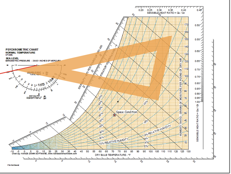
The trick now is to somehow move the line so it goes through the point of interest and crosses the saturation curve. In the olden days, when we were using paper charts, we would use a drafting trick that used two triangles to shift the line. We would start by laying one triangle so that it matches the slope of the line we wanted to transfer, like this.
Next, we would put a second triangle up against the first triangle like this.
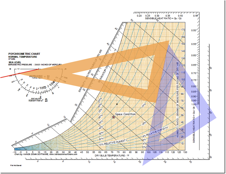
Then, we would slide the first triangle down the second triangle until the side that matched the SHR line on the SHR scale passed through the point we were interested in, like this.
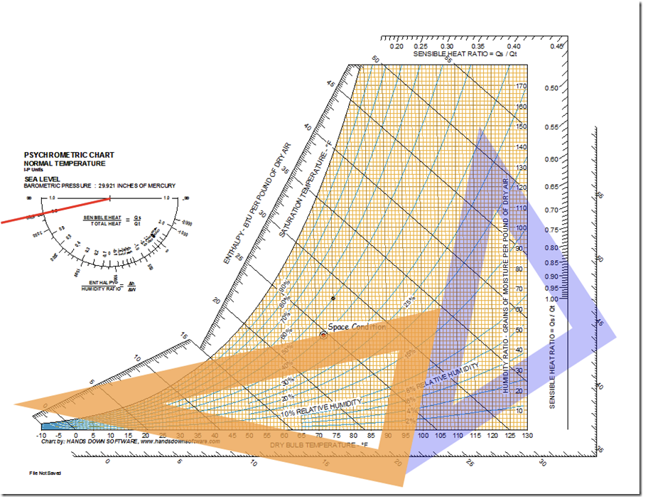
Finally, we would draw the line, using the triangle as a guide, which would leave us with this.
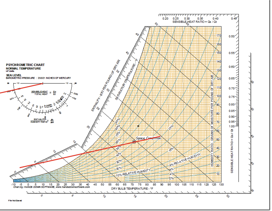
Like I said, that was how we did it in the olden days, and when I retire, I will no doubt end up in the local HVAC museum showing curious children how to do this. I can just see the excitement in their little eyes as I explain what paper and pencils where and lay actual triangles on a paper psychrometric chart to transfer the line. In fact, I was about to show my grand daughter but she suddenly realized she was coming down with a cold and said she had no choice but to leave the room to minimize my exposure to it.
The reality is that we live in an electronic age, and there are a lot of good things about that, including how easy it is to transfer the SHR line. Lets go back to the copy of the chart that we put into PowerPoint and see how you would do that. We will start with a chart that has the SHR line plotted on the little protractor thingy.
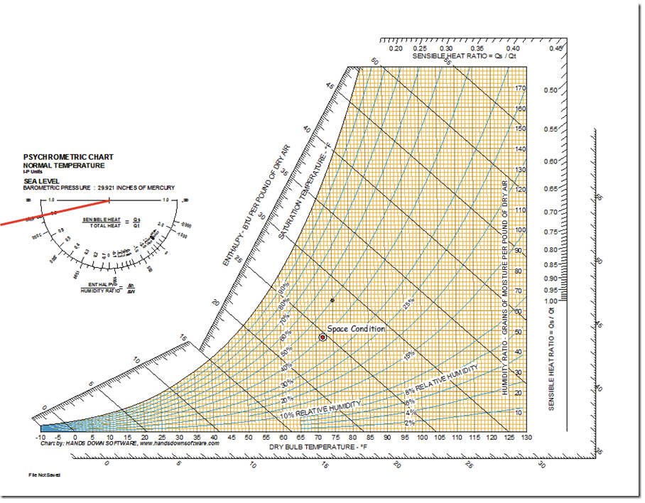
You can very easily shift this line to the space condition point with the arrow keys. Just click on the line and then use the down arrow and right arrow key or your mouse to move it until it intersects the middle of the space condition. When you finish, you should end up with something like this.
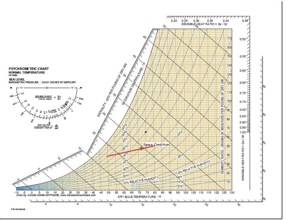
The problem now is that the line does not extend through the saturation curve because it is not long enough. You can also solve that problem electronically. Specifically, if you click on the line and then the format tab that shows up when you do that, you will notice that there is a Size item on the menu.
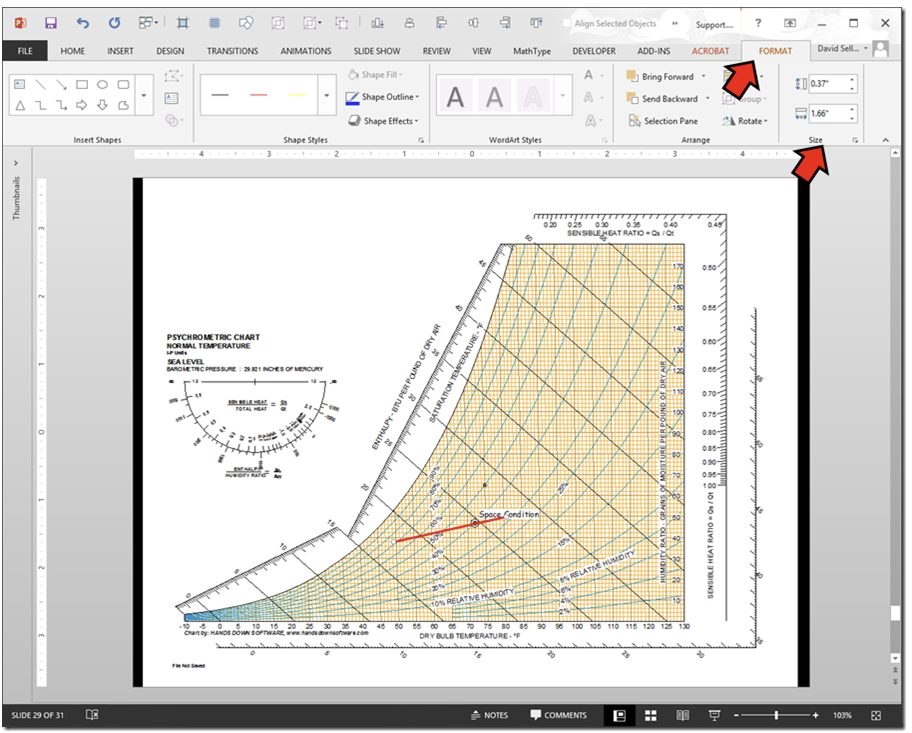
If you click on the little arrow in the box at the lower right corner of the Size menu item, a dialog box opens up that will allow you to format the shape you have selected, in this case, the SHR line. It should automatically open up the tab that is associated with size.
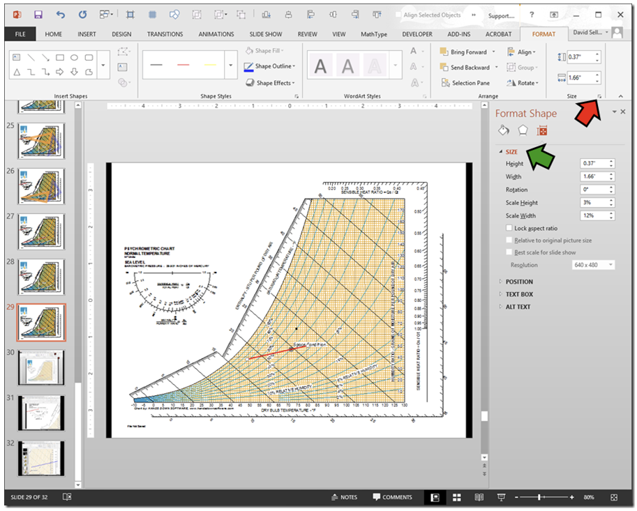
Even though we are thinking of our SHR line as a red angled line, the drawing tools in PowerPoint, Word, etc. actually think of it as the diagonal joining the opposite corners of an invisible box. The length and angle of the line are actually controlled by changing the height and width of this invisible box.
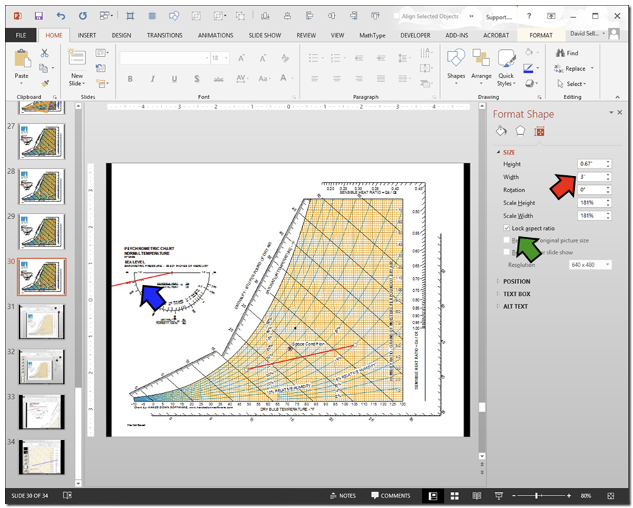
So, if you first lock the aspect ratio of the image (green arrow below), you can then change either the height or width of the object and the dimension you didn’t directly change will be changed in proportion to the one you did change. That means that by virtue of the locked aspect ratio, if we make our line longer, the slope of the line, which is set by the SHR, will not change.
For example, if I select my SHR line, lock the aspect ratio (the green arrow below) and then make it 3 inches wide (the red arrow below), I get a longer line that has the same slope as the line originally had; in other words, the slope matches the slope of a line through 0.8 on the SHR index (the blue arrow below).
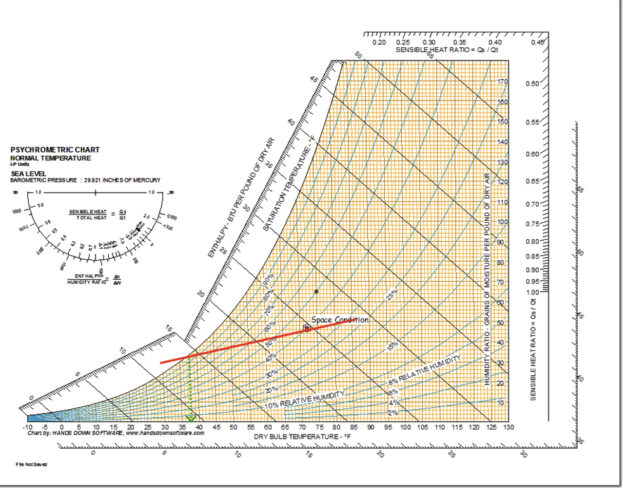
Now, all you have to do is shift the line back to where it runs through the space condition point and also crosses the saturation curve. Doing that tells you that if you really wanted a 72°Ftdb/40% RH space and the loads in the space had a sensible heat ratio of 0.8, then you would need an Apparatus Dew Point (ADP) of about 37.5°F, which is pretty cold.
Apparatus Dew Point
The ADP is the point where the SHR line crosses the saturation curve, read from the dry bulb axis at the bottom of the chart.
ADP is another theoretical number that I will go into in a future post, but for now, suffice it to say that if you know the ADP required by a load, then you can make a coil selection using any number of different approaches. The Bypass Factor method developed by Willis Carrier is one example of an coil selection technique that uses ADP and if you want to know more, you will find it discussed in the slides I mentioned previously. This image zooms in on the chart above so you can read the ADP better.
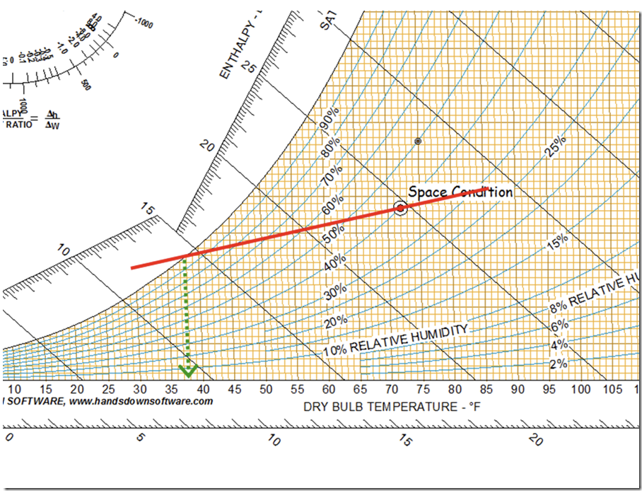
Incidentally, note how the dry bulb temperature lines on the chart are not perfectly vertical, so you need to take that into account when you are plotting points and projecting dry bulb temperatures on the chart.
Plotting a Mixed Air Condition
To finish this post, I am going to make an addition to our little HVAC system that will make it more realist. Specifically, I am going to add ventilation air from outside and then use that to demonstrate how you plot a mixed air condition on a psych chart. I will use the Pro version of the chart to make it a bit faster for me and to illustrate a few other features of that chart.
But by using techniques like I just discussed, you can do the mixed air analysis with the basic version of the chart by plotting your points and then working with a copy of the chart in PowerPoint.
Let’s start by modifying our system diagram to include a number of things that you would likely encounter in a real world application.
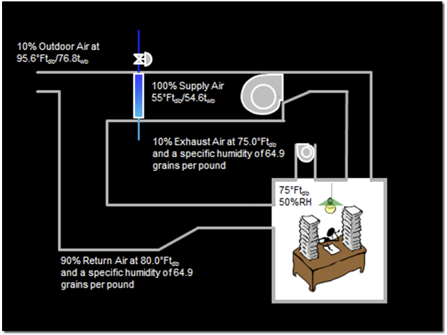
For starters, we will add a duct that introduces 10% ventilation air, which then leaves the system by a small exhaust fan. To make things interesting (in a nerdy sort of way), we will put our system in St. Louis, which has both extremely hot and humid days as well as extremely cold and dry days. Thus, the outdoor air we will be introducing can have a range of impacts on our system, depending on what is going on outside.
With the basic version of the chart, you would need to look up the outdoor design condition in some other resource, like the ASHRAE Handbook of Fundamentals or an internet search. But if you have upgraded to the professional version of the chart, that information is built in as a tool you can open up, specifically, the HDClimatic Tool, which shows up in the drop-down menu under Tools.
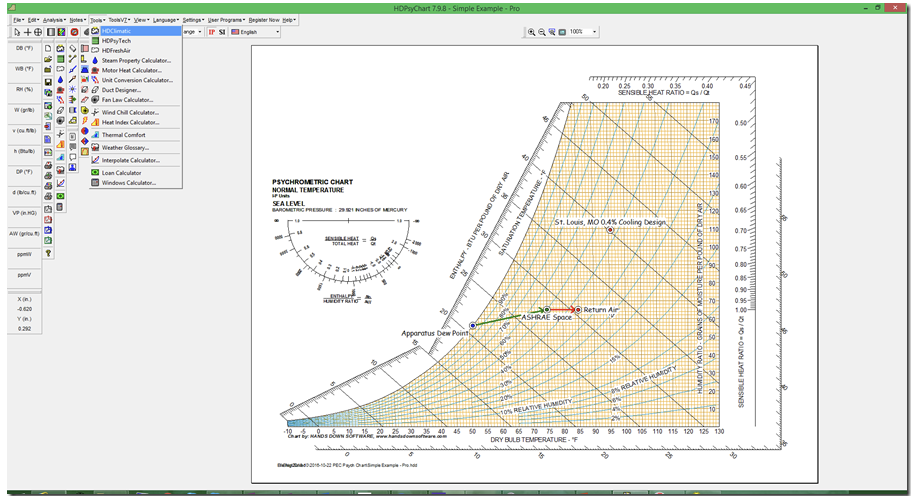
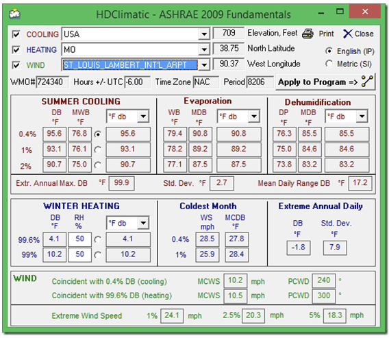
The data behind the tool is the ASHRAE data so it covers many, many locations through-out the world. Here is what that looks like for St. Louis, MO from my professional version of the psych chart.
If you look at my system diagram, you will discover I have also made the return air warmer than the space is, which is what happens in a real system if the return duct runs through a hot ceiling plenum or across the roof on a hot sunny day. Since all of the energy gain was in the form of sensible energy, the specific humidity (and dew point temperature) of the return air did not change from the space condition. The dry bulb temperature changes along with the relative humidity since, unlike specific humidity relative humidity is a measure of the moisture content of the air relative to what it could hold at the current temperature.
Specific humidity is a measure of the absolute amount of moisture in the air. Common units include pounds of moisture per pound of air and grains per pound, which is what the professional version of the chart defaults to. You can change the units along with many other settings like colors, line weights, etc. using the Chart Profile Control tool on the Settings drop down menu in the professional version of the chart.
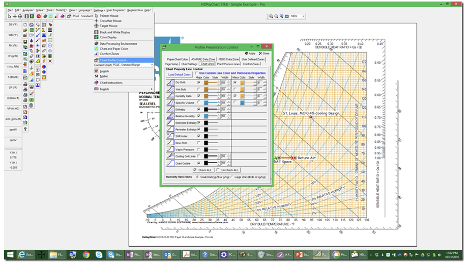
Some of you may be wondering why we would use some weird unit like grains per pound to measure specific humidity. The reason is that back in the olden days, we did all of this stuff with papers, pencils and slide rules.
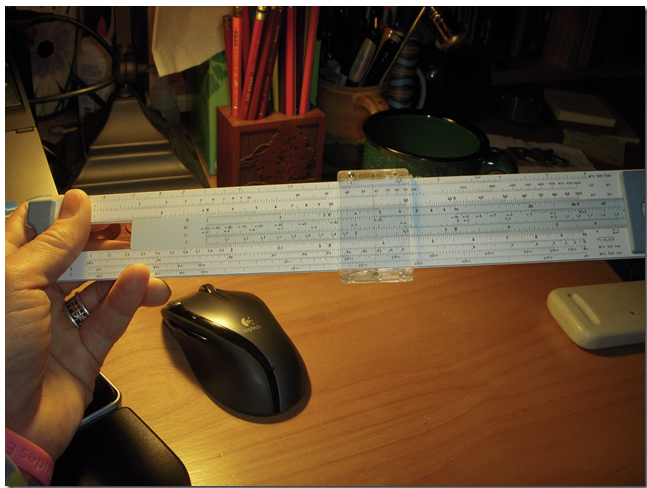
When you were using a slide rule, you were accurate to 1 or 2 decimal places and numbers with a lot of leading zeros were trickier to deal with than numbers with out them. If you use units of pounds of moisture per pound of dry air for specific humidity, you end up with some very small numbers, for instance 64.9 grains per pound becomes 0.0093 pounds of moisture per pound of air since there are 7,000 grains in a pound. So, by using grains of moisture per pound of dry air, it was easier to work with the numbers since they had fewer leading zeros. Now, with computers and calculators, its not so much of an issue.
The bottom line on this is that we can figure out the return condition by assuming a constant specific humidity or a constant dew point and using that as our indication of moisture content along with the dry bulb temperature we anticipate for the return air.
You could come up with the dry bulb temperature via a number of ways, including a somewhat complex heat transfer calculation for the duct or an estimate based on past experience, or for an existing building, a field measurement. Here is what our system looks like with the changes we have been considering
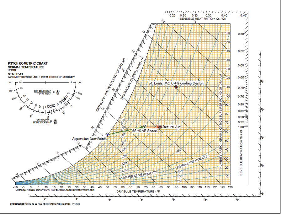
And here are the state points plotted on the chart, along with the process for the air as it moves from the cooling coil to the space (the green line) and the space to the return connection at the AHU (the red line).
To select the cooling, we need to know the entering condition, which is a mix of the return air and outdoor air. It turns out that when you do the analysis on that based on the steady flow energy equation and conservation of mass and energy, the mix point will lie on a line connecting the two state points of interest and its position on the line will be proportional to the percentage of total flow represented by each of the state points.
In practical terms, what it means is that you can plot the line on the psych chart and get your answer. To do that with the basic chart, you need to plot the outdoor air point and return air point using the tools in the chart and then move an image of the chart to PowerPoint and work out the mixed condition by drawing and measuring lines. You can see an example of that in the economizer post I just mentioned under The Psych Chart, A Graphical Approach to the Same Problem topic, and that is how we did it in the olden days. Its not particularly complex and doesn’t really take that long once you have done it a couple of times.
But, the professional version of the psych chart makes the mixing analysis even easier. The reason is that the professional version of the chart gives you quite a few more processes to chose from in the Process column of the Psychrometric Process window, including an air mixing process. This is what that looks like.
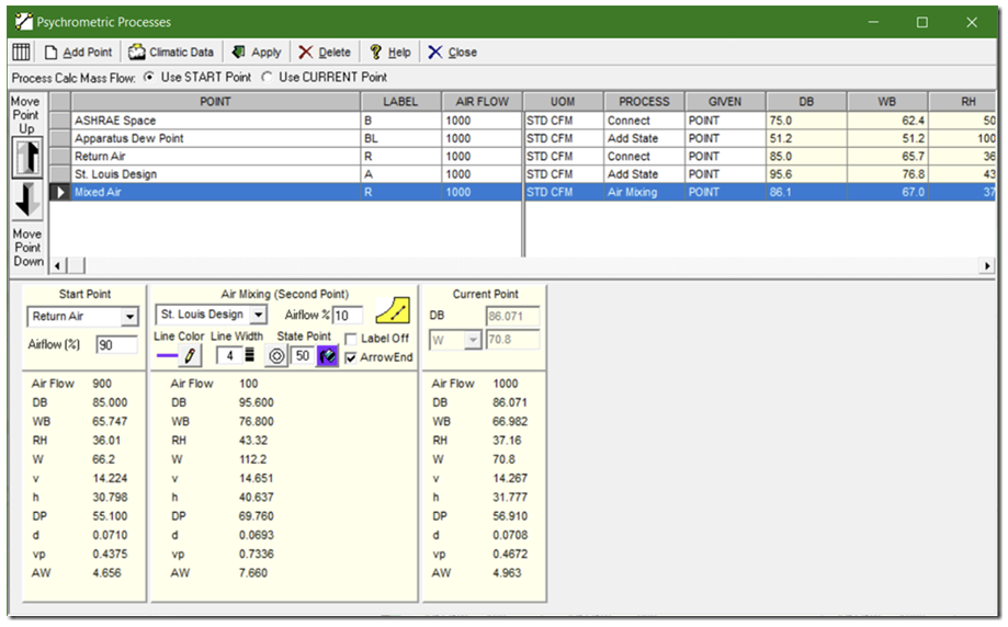
Notice that I have selected Air Mixing as my process, picked the two state points that I want to mix and specified the percentage of air from each state point in the fields in the lower left of the Psychrometric Process window. When I do that, the conditions for the mixed air point are calculated and displayed for me under Current Point. And when I click on Apply, the point is added to my chart, along with lines connecting it to the two state points associated with it.
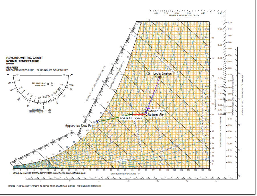
By reading the information directly from the chart, or by looking at the data table in the Psychrometric Process window…
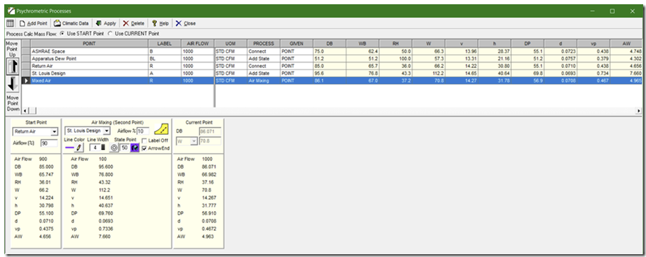
… we can see that the entering condition to our cooling coil on a design day will be 86.1tdb/67.0twb.
I should point out that in both versions of the chart, you can drag the side of the Psychrometric Process window to make it wider and see all of the psychrometric data for each point in the table, which is what I did to make the image above.
You can also copy the data table to your clip board in both versions of the chart using the Copy Chart Data to Clipboard tool on the Edit drop down menu.
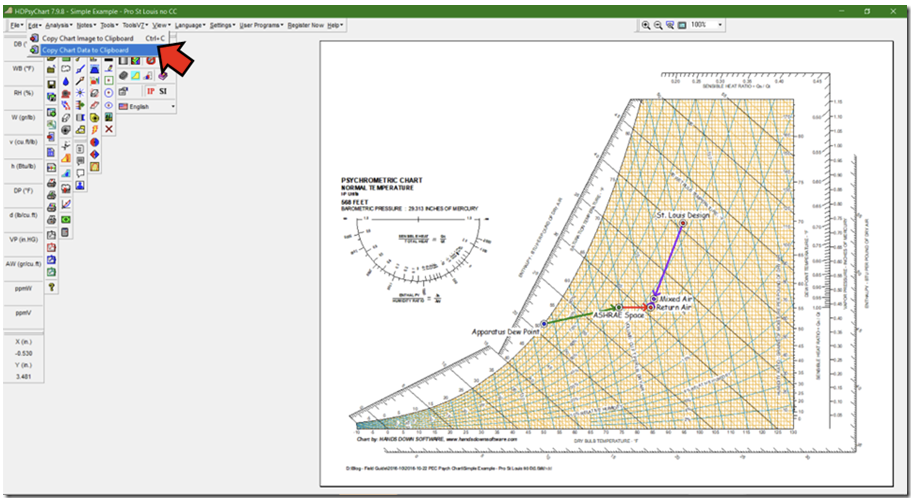
Having done that, you can then paste it into another application like Excel to work with the numbers mathematically or create your own data table or both.

Note that the table also includes other useful information where appropriate, like the SHR or the energy added or removed given the air flow for connected state points. Bear in mind that the chart is actually calculating all of this information to multiple decimal places. So, for instance, even though the return air condition is based on the space condition with no moisture added to it (SHR = 1), a very small moisture difference actually shows up because of the accuracy I used to enter relative humidity (100% vs. 99.999999%).
In any case, having determined the mixed air condition, which is the coil entering condition, we can complete our plot of the HVAC process occurring for our system by connecting the ADP to the mixed air point using the Cooling Coil process in the Psychrometric Process window.
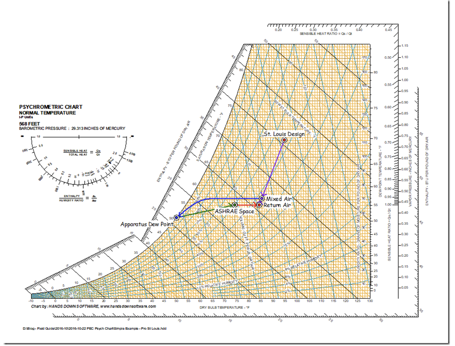
Hopefully, at this point, you have seen that either version of the chart can be quite useful if you are working with HVAC systems and trying to understand what is going on in them. If you do that sort of thing a lot, then the professional version of the chart will probably pay for itself by streamlining your process. Plus, the professional version includes a number of very useful tools that I have not used up to this point. So, I will close by showing you a few of the ones I use the most.
Professional Version Extras
Bin Plots
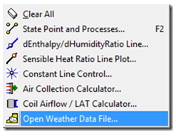
One of my favorites is to do a bin plot of the climate data for a particular location on the chart. The professional version of the chart has the Typical Meteorology Year 2 and 3 files (TMY2 and TMY3 files) built into it. You can access that data from the Analysis drop down menu using the Open a Weather Data File tool. If we do that for the HVAC process we just analyzed, it looks like this.
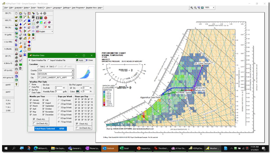
The warmer colors are areas on the chart with the most hours and the cooler colors are areas on the chart with fewer hours; the little color code key tells how many hours are in each bin and you can control the size of the bins and which hour, day, week, month, etc. is shown via the options in the weather data window.
As a result, we can see that even though we modeled the system on the design day, it could actually see conditions that were more extreme and modeling those conditions may be of interest to us. By changing the values for temperature and RH for the outdoor air condition, we can quickly assess how that impacts our HVAC process. In the summer …
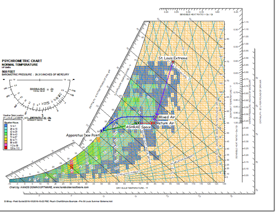
… we would discover that we need a bigger cooling coil if we absolutely always want to deliver our space cooling design target.
Note that the cooling coil entering conditions are now 86.3tdb/67.5twb vs. 86.1tdb/67.0twb that existed using the St. Louis design condition. This does not seem like much of a change, but the cooling coil selected based on this condition would have different characteristics, including a higher refrigerant flow rate.
The impact is also very dependent on the outdoor air percentage. Notice what happens if we made our selection based on 90% outdoor air, first for the design day …
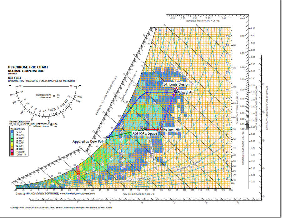
… which gives a cooling coil entering condition of 94.6tdb/75.8twb, and then for the extreme day …
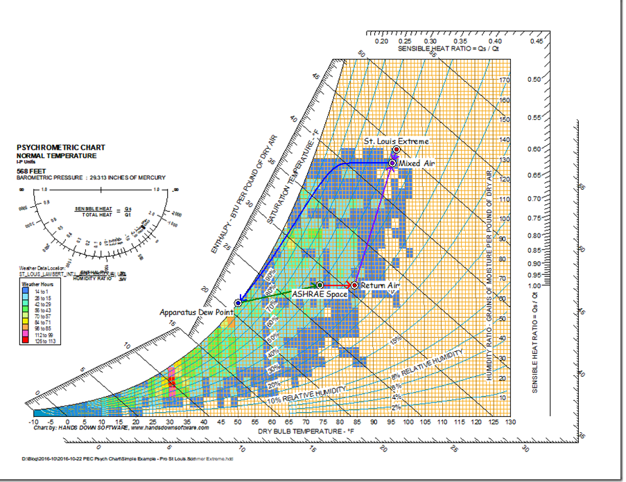
… which gives a cooling coil entering condition of 96.4tdb/79.3twb.
In the winter …
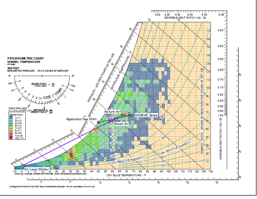
… we would discover that even on an extreme day, the mixed air plenum should be nowhere near freezing if we are only using 10% outdoor air, even if the return air is now coming back colder than the space instead of warmer than the space. That means that if perfect mixing occurs, our little system would not need a preheat coil and it would not have a freezestat trip unless something went wrong.
This is an important thing to be aware of when you are operating buildings and doing retrocommissioning because it is not uncommon to see active preheat coils, nuisance freezestat trips, and frozen coils under conditions where they should not have occurred if you plot the process out on a psych chart (or do the math). When those conditions exist, they are likely the result of less than perfect mixing, which is very common in mixed air plenums. That means that if you can improve the mixing, you can solve problems and save energy.
Our analysis also says we would not need to humidify since the mix point is right on the SHR line, assuming of course we had started out with a specific humidity in the building of about 57 grains per pound and the latent loads in the space were about the same as they were on the design day.
But, unless the building was totally leak free, including free of the leakage of water vapor (which will migrate against air flow and move from the place with the highest vapor pressure to the lowest) it is unlikely that we would maintain our targeted space condition with out adding some moisture. After all, ultimately, the air inside the building came from outside of the building and on the extreme winter day, that air is very, very dry and it will enter the building via other mechanisms than our HVAC system, including infiltration, traffic through doors, and envelope leaks.
Note also that since our mixed air temperature is above our target, if the space we are serving really requires an ADP of 52.1°F to meet the space condition, then even with it being extremely cold outside, we would need to do some mechanical cooling and the coil would be wet if the indoor humidity levels were really up at the design conditions. The load on the coil would have dropped due to the introduction of the colder, dryer outdoor air. And again, the building would have to be perfectly leak free for this condition to exist.
If we added an economizer to our system so we could make our targeted leaving air temperature of 51.2 by mixing cold outdoor air with warm return air and not running mechanical cooling, we would discover that on the extreme day, it would require about 35% outdoor air to hold our targeted discharge temperature.
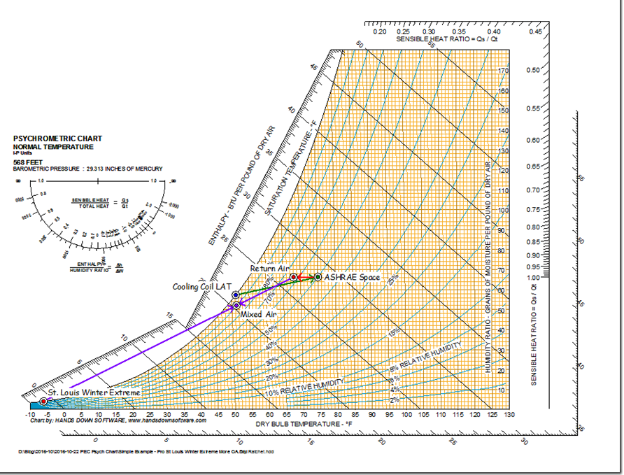
And since the mix point has a specific humidity below 57 grains per pound, we would need to humidify a bit to keep the building moisture level where we wanted it. If we didn’t humidify, the dry mixed air created by the economizer process would eventually drive the indoor relative humidity down.
You can get a sense of where you might end up by assuming that the worst case specific humidity at the mixed air condition was the same as the outdoor air (which is where the air in the building came from) and then plot the SHR line through that point and look at where it crossed your indoor dry bulb temperature target. You could then calculate the mixed condition from this point as shown below.
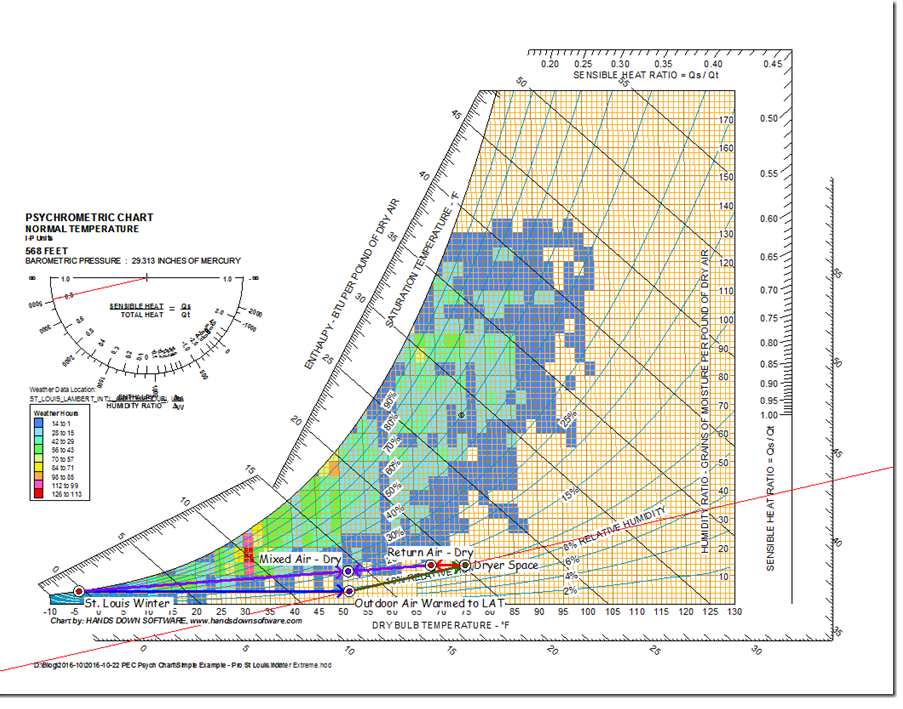
Of course, the moisture added to the air by the load would tend to ratchet the mixed air condition up
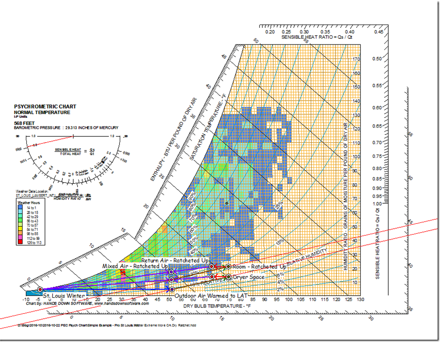
But infiltration and other factors would tend to dry out the air more than the economizer process would acting on its own, so my best guess is that the space would float around somewhere between the lowest possible specific humidity and the best case specific humidity.
The bottom line, for me at least, is the bin plot feature of the professional chart is a really powerful tool and the one I probably use the most. That is because it allows me to juxtaposition the dynamics of the climate against the dynamics of the system and make appropriate design and operating decisions on that basis.
Bin Data Tables
If you looked closely at the bin data dialog box, you will notice that you also have the option of exporting the bin data to a Data Table. When you select that option, you can then pick a text file or Comma Separated Value (CSV) file and when you tell the tool to Create a Table, it does just that and the table will open up in Notepad (.txt file option) or Excel (.csv file option). When I select the CSV option for the St. Louis data we have been looking at, it comes up looking like this.
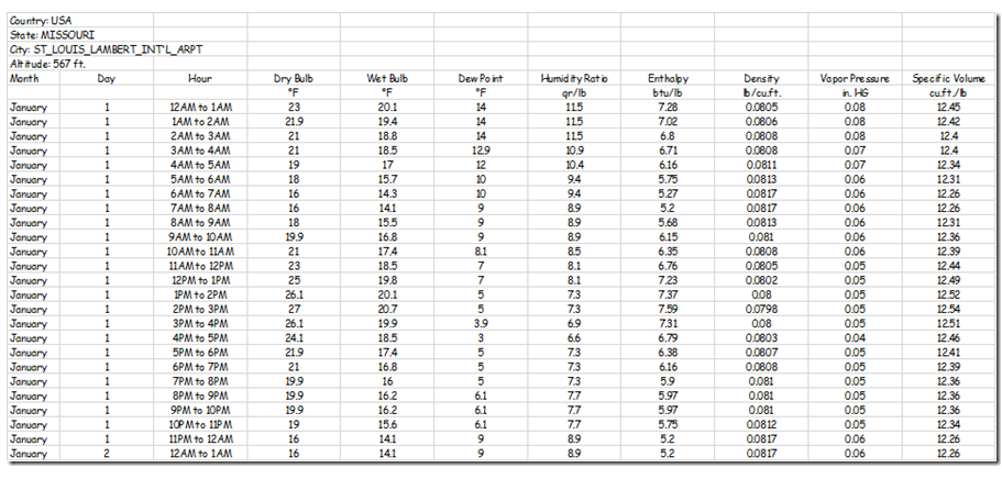
If you look at the full file, you will discover there is a line in it for each hour of the year with all of the associated weather data. If you save this file as an Excel workbook, you will then be able use things like the KW Engineering Get Psyched functions and basic HVAC equations to perform hour by hour energy calculations against a normal climate year.
You could even use Excel’s VLOOKUP function to import data from a logger or trend file for each hour and figure out what it costs to operate a dysfunctional system for a year. You could then repeat the calculation with more appropriate parameters reflecting repairs to the system, which is what it would cost to run the system properly. The difference between the two numbers is the savings potential.
ASHRAE Design Data
Another feature I frequently use is the ASHRAE design data feature that is included in the Pro version of the chart in the Tools drop-down menu. This is the feature I used earlier in the post to get the design data for St. Louis, so I won’t say a lot more about it. I will point out that in addition to the design day data for a number of winter and summer design conditions, you also get the extreme day data, wind data, and location information.
Steam Property Calculator
Another handy tool is the Steam Property Calculator, which also shows up in the Pro version in the Tools drop down menu.
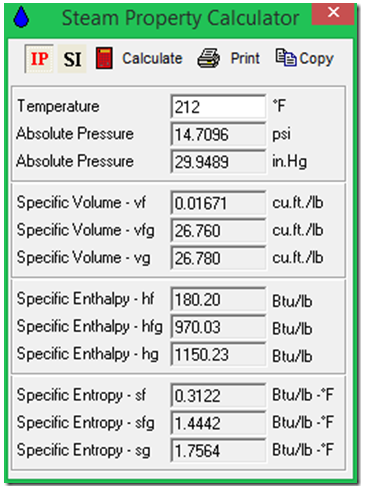
The tool is basically a steam table where you can type in one property and read back all of the other properties at that condition at saturation. In the example above, I have entered 212°F and the tool returned all of the metrics for steam at atmospheric pressure.
Motor Heat Calculator
There is a motor heat calculator included in the Pro version of the chart that tells you what the temperature rise will be across a fan due to the fan heat and the motor efficiency losses into the air stream. In this example, I entered the flow rate and fan static pressure and static efficiency and the motor efficiency and the other metrics were provided by the calculator when I clicked on the Calculate button.
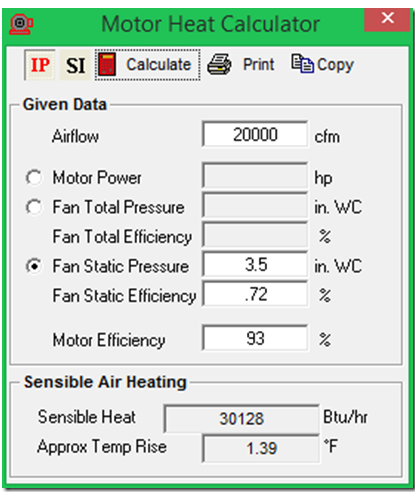
Note that you still need to add the belt losses, which could be another 2-3% for a well maintained system and maybe as much as 10% for a system where the belts were screaming when the fan ran. If the motor is not in the air stream, then setting the motor efficiency to 100% will eliminate the motor efficiency losses from the assessment.
If you are not familiar with fan heat, Jerry Williams wrote a really great pair of articles for Heating, Piping and Air Conditioning magazine a while back. The articles are old enough that they aren’t in the digital archives. But, as physics tends to be, the concepts are still perfectly valid and I have placed copies of the articles on my Google Drive at this link if you want to reference them.
Conclusion
Hopefully, this gives you a sense of how to go about using the basic version of the HDPsyChart and some insight into the advanced features you would get by upgrading to the professional version. I have only only listed the professional tools I use the most, meaning I have only scratched the surface in terms of what’s in the package, including the ability to use different languages.

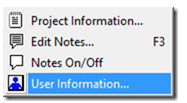
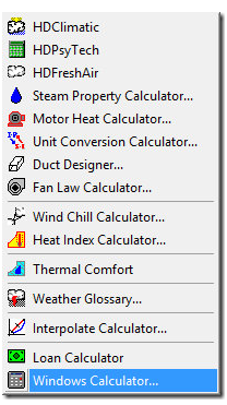
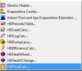
These screen shots of the various dropdown menus included with the Pro version should give you a pretty thorough picture of the features I didn’t highlight.
Analysis menu
Notes menu
Tools menu
Toolsv7 Menu
Settings Menu
